From zero design to "good enough"
If you've been following the series, you already know how Sortit.Now started: with a single prompt, 5,000 lines of spaghetti code, and a UI that looked like it was designed in the early 2000s. It worked, but it wasn't pretty.
And honestly, I didn't care at first. In those early days, I just wanted functionality. Could I add projects, tasks, actions, and see them in a timeline? Could I connect with Google Calendar? That was enough. The UI was plain buttons, inputs, and boxes that barely lined up.
But at some point, "it works" wasn't enough anymore. If I wanted to use Sortit.Now every day, it needed to feel better. If I wanted to share it with others, it needed to look better.
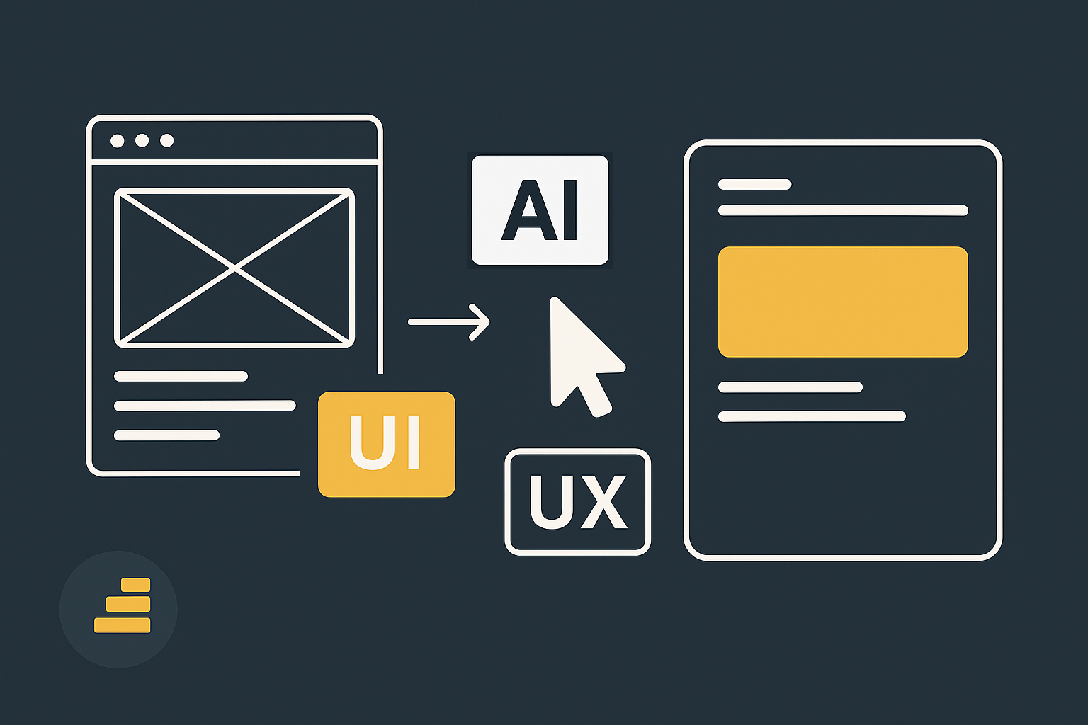
AI as my accidental designer
I'm not a designer. I can tell when something looks off, but I'm not the type who can sit down with Figma and create a stunning design system. Here's where AI surprised me the most.
When I had no clue where to start, I'd ask:
- "Suggest me a modern color palette."
- "What layout options would make this easier to read?"
- "Show me three variations of button styles."
The AI would throw ideas at me. Some were terrible, others just didn't fit, but every suggestion pushed me in the right direction. Sometimes it even came up with things that felt completely fresh. The history navigation was 100% its idea, and it was so good that I embraced it immediately.
In the end, I chose two colors that I really liked, and AI helped refine them, adjusting shades and usage so they felt more professional.
There was no consistency, and I had to spend time fixing that, but in terms of pure UI inspiration and ideas, AI helped a lot. And although Sortit.Now isn't the most beautiful app in the world, it looks professional enough to stand next to tools I actually use every day.
The frustrations of design with AI
Of course, design with AI wasn't all magic.
- It loved to invent new styles out of nowhere.
- It would standardize buttons on one screen and forget them on the next.
- Inline styles kept sneaking in, even though I told it not to.
There were nights when I wondered if I should just give up and live with the inconsistencies. But I kept at it, and the effort paid off.
The turning point: consistency
The breakthrough came when I decided to stop adding features for a few days and focus only on consistency.
- All buttons shared the same shape, color, and hover effect.
- All forms followed the same layout rules.
- Typography was standardized.
- The color palette was locked and applied across the app.
This wasn't glamorous, but it changed everything. Suddenly the app felt like one product, not a Frankenstein of screens stitched together.
The parts of the UI that mattered most
Some areas had a bigger impact than others:
- The home screen. This is the first thing you see when you open Sortit.Now. It had to be welcoming, clean, and not overwhelming.
- The project list. It's where I keep track of my projects, so readability and structure mattered a lot.
- The calendar. This is where I spend most of my time. If the calendar UI was confusing or ugly, the app wouldn't be usable. Making it clear, interactive, and connected to my workflow was essential.
Once these three were solid, the rest of the app started to feel coherent.
When "ugly but functional" became "I'd show this to someone"
The best moment came when I realized I wasn't embarrassed anymore. I could open Sortit.Now in front of someone else without immediately apologizing for how it looked.
It wasn't fancy, but it was coherent, consistent, and professional enough. And that's all I needed.
Lessons from the UI/UX journey
- Design matters more than you think. Functionality gets you started, but design keeps you using the product.
- AI is a great design partner. It gave me palettes, ideas, and even entire features I wouldn't have thought of.
- Consistency beats beauty. Professional doesn't mean stunning, it means coherent.
- You need to do the cleanup. AI is great at ideas, terrible at discipline.
- Focus sessions pay off. Stopping to fix design made every feature easier to use later.
Closing
Sortit.Now started as a messy experiment. But little by little, the UI and UX evolved into something I actually enjoy using every day. AI wasn't just my coding partner, it was also my design partner. It gave me options, colors, ideas, and even surprises like history navigation that became part of the product's DNA.
It's not perfect, but it's polished enough to be real. And for a side project built in spare time, that's a win.
In Part 5, I'll share the debugging stories and problem-solving approaches that kept me up at night, and how AI both helped and complicated the process of fixing complex issues.